DevBlog 05
Where am I? 🤔 – Creating Maps for FPS Games
Similar to racing games, maps in FPS games have a significant impact on gameplay because they define strategy, and it can be difficult to balance the game map without giving an advantage to one of the sides.
Imagine playing on a map with only a few shelters to take coverage from fire and a few close angles behind doors and entrances to look out for possible enemies. This would allow a lot of different strategies from players in order to adapt to the map and find the best spots to catch the enemies by surprise.
The famous Counter-Strike map, Dust2, is a great example of how a great map design can have an impact because of its simple yet effective design.
You’ve probably seen the famous double doors. Yes, the ones in the middle of the three separate corridors leading to the bombsites.
Dust 2’s massive success led to it becoming the most played map by far, as well as being passed down from different versions of the game, beginning with the 1.6 version and continuing to the current Counter-Strike version (Counter-Strike Global Offensive).
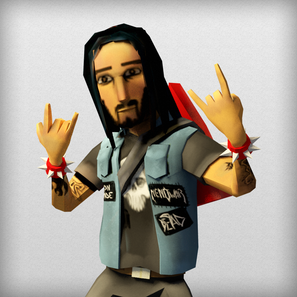
Following up on the last DevBlog, in which we revealed the first character in the game, we are now designing the first game map.
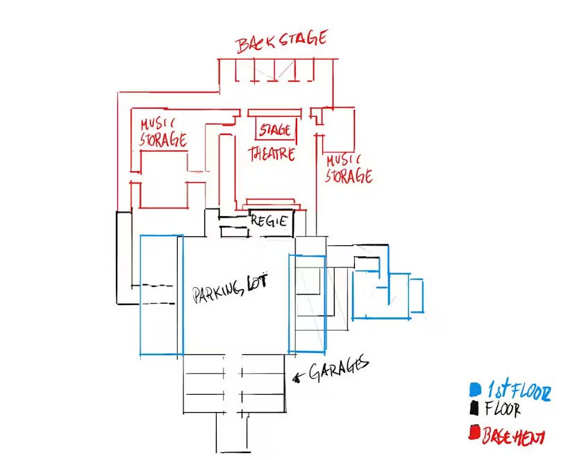
We started by sketching map ideas in Photoshop based on the game’s urban-style theme. We envisioned the map to be at a concert venue with at least two floors, so we began drawing elements such as the stage, rehearsal room, ticket office, parking lot, backstage, and so on.
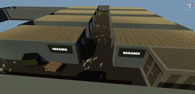
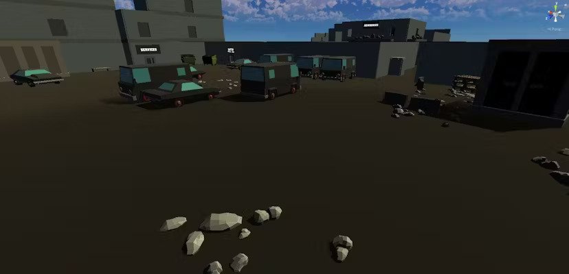
We started designing the game map on the Unity game engine right after the sketch, and as we added structures, we also adjusted and added new areas to the game map to make it more simple and fun.
As soon as the gameplay tests begin, we will, without a doubt, be changing the map on a regular basis. He’ll need tester feedback to make the game as balanced as possible, so that everyone can enjoy it without feeling like it’s too polarized.
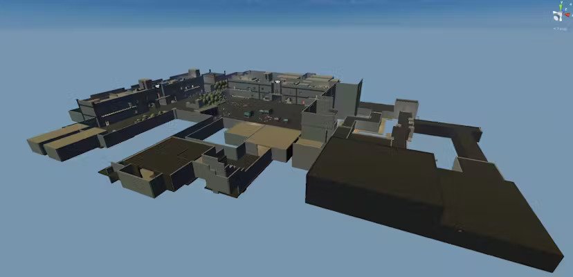
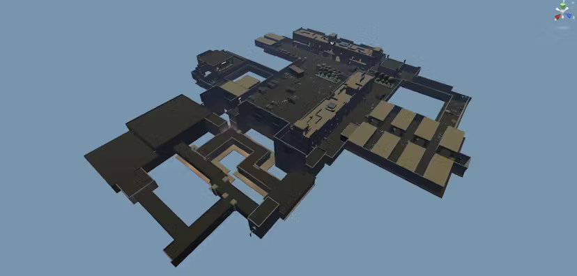
The first conceptualization of the game map has 6 main spots: stage, backstage, parking lot, warehouse, residences, and garages.
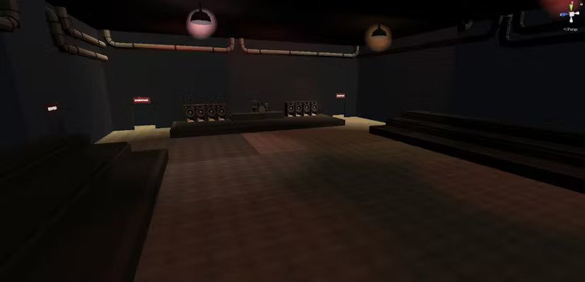
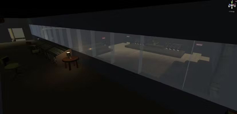
The stage was the first structure to be built, so we determined that it needed instruments on the actual stage, a place for the audience to watch the show, and a control room where the lights and sound were managed.
Backstage is the area that connects the stage to the garages and is usually where the performers’ dressing rooms are, so we designed it as a series of corridors that lead to the various stage entrances as well as the garages.
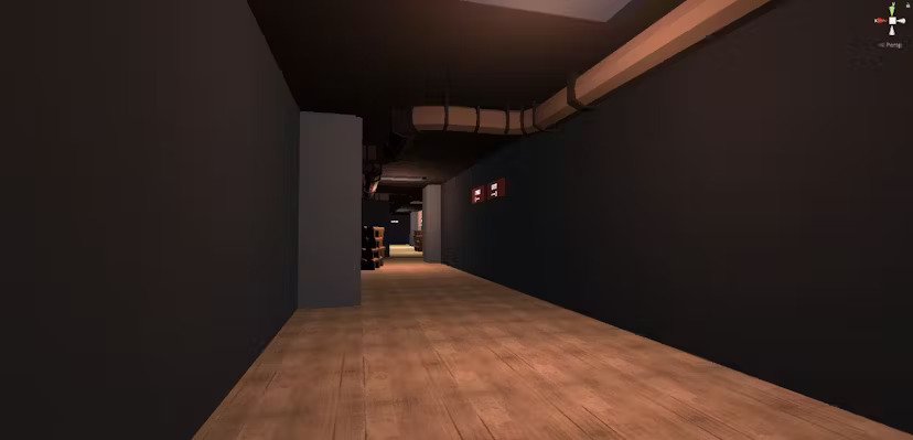
We anticipate the most in-game action to happen in the parking lot, which will be a large open space in the center of the map with only a few hideout spaces behind the vans parked there. If you want to live longer when the game comes out, we recommend being extra cautious in this zone.

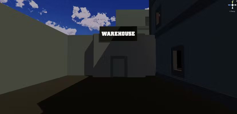
The Warehouse will be buildings surrounding the parking lot where players can hide and reload their weapons before engaging in combat. There will be a lot of musical instruments and sound systems around the warehouse, making it a great hideout.
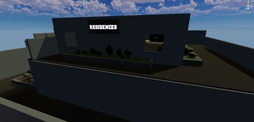
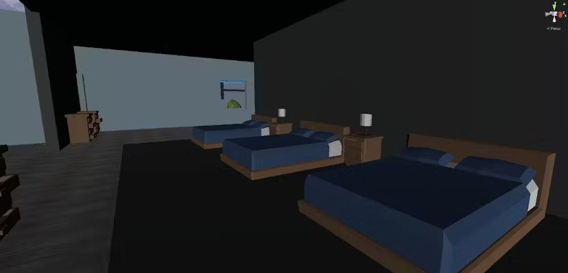
The residences represent the apartments where the performers rest, but they also serve as excellent spots for sniper rifles because they are located on higher floors, giving it the advantage for long-range weapons.
Last but not least, we have the garages, which will be located behind the stage and will include band equipment as well as some musical instruments resembling a good old garage band.
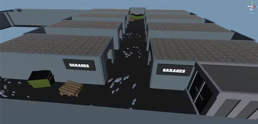
Now that the majority of the structures have been implemented in Unity, we’ve begun to add textures to the assets and work on the environment lighting. Even though our game style is more cartoonish and less realistic, light still plays an important role in balancing the game environment and can provide an advantage in situations where a player can’t see certain zones as clearly as others.
